A 2nd year college packaging project done for Saaraketha organics. The brief was to brand their new juice varieties for both young couples and kids. I named the brand "yusha" which is sinhalese for juice, and the logo was done in a round, cursive font so as to mimic South Asian script.
The adults packaging concept is inspired by the fact that organic farming follows traditional farming methods.While the kids packaging is meant to be more fun showcasing playful animals.
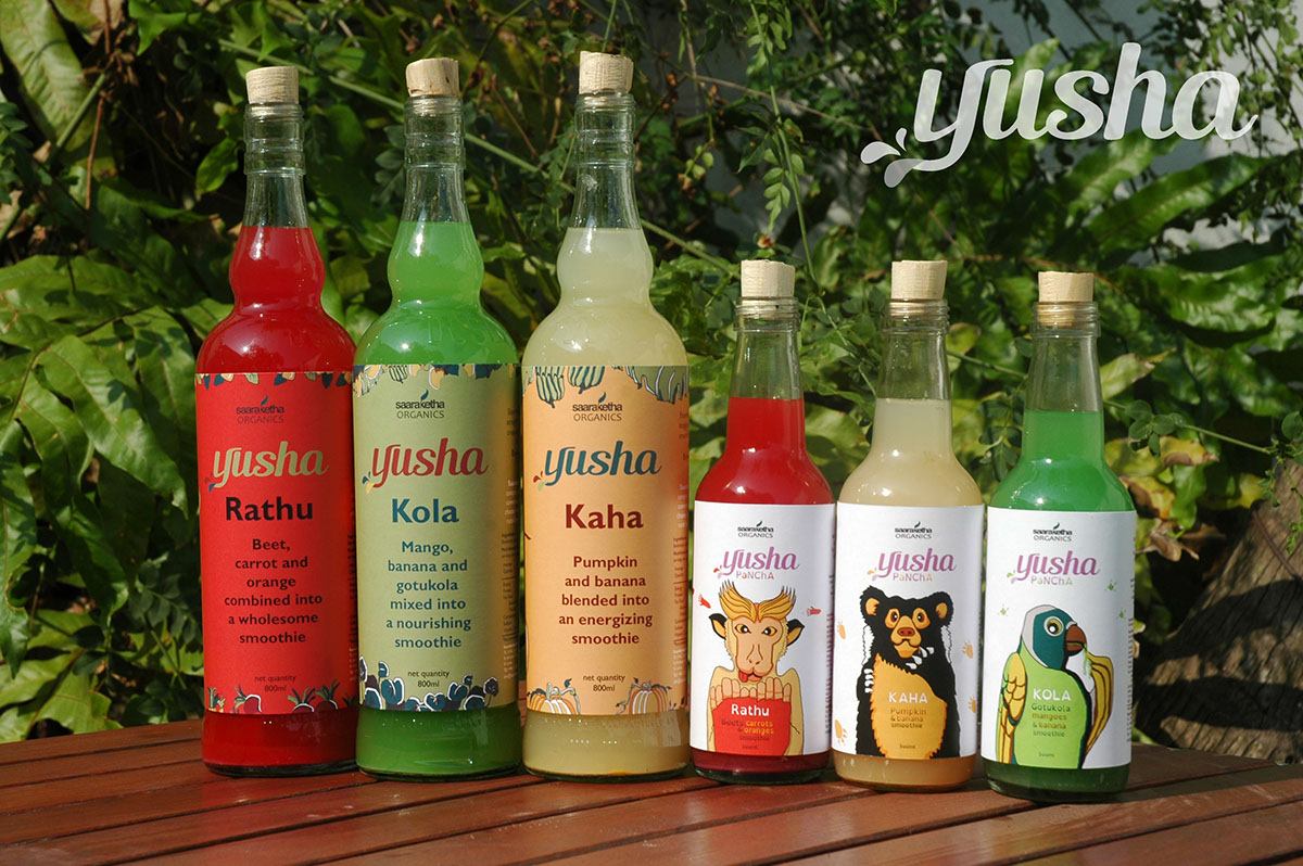


With the kids packaging,you see a story when you look at the label. In one angle you see children trying to figure out who's been at the juice, and the mysterious footprints. The mystery solves itself as you turn the bottle and see the full picture.


